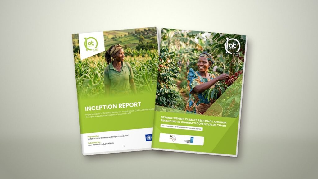
Most organisations we work with publish their most important ideas as PDFs: annual reports, strategic plans, policy briefs, budget analyses. Very few of those PDFs can be read properly by someone using a screen reader, a phone with large text or a slow connection.
That is starting to matter beyond good practice. The European Accessibility Act has applied since 28 June 2025. It covers many digital products and services offered in the EU, including by organisations based outside it, and customer facing documents such as reports, forms and product information can fall within its scope. The benchmark most people use is WCAG 2.1 level AA, with WCAG 2.2 now the current version of the guidelines.
Not every African organisation is directly covered. But if you work with European funders, partners or customers, you will increasingly be asked whether your publications are accessible. It is far easier to design for it from the start than to fix a finished report.
What makes a PDF accessible
- Real text, not pictures of text. Scanned pages and text flattened into images cannot be read aloud or searched.
- Tags and reading order, so a screen reader moves through headings, paragraphs and sidebars in the right sequence.
- A proper heading structure: one title, then chapter and section headings in order.
- Alternative text for charts, maps and photos that carry meaning.
- Tables built as tables, with header rows marked, not drawn with lines and text boxes.
- A document title, language setting and bookmarks.
Design choices that help everyone
Accessibility is not only a technical layer added at the end. Many of the biggest gains are design decisions:
- Contrast. Body text should have a contrast ratio of at least 4.5 to 1 against its background. Light grey text on white and white text on pale photos often fail.
- Type size and spacing. Body text of 10 to 11 points in print, comfortable line spacing and short line lengths make long reports easier for everyone.
- Do not rely on colour alone. Charts should use labels, patterns or direct annotations so they work in black and white and for colour blind readers.
- Plain headings. A heading like “Key findings on county revenue” helps navigation far more than a clever one word title.
- Links that say where they go, rather than “click here”.
A simple workflow
When we design a report, we build accessibility into the process:
- Agree the heading structure with the author before layout starts.
- Use paragraph and character styles throughout, never manual formatting, so tags export correctly.
- Write alt text for each figure while the content is fresh, ideally with the author.
- Export a tagged PDF and check it with an accessibility checker such as the one in Adobe Acrobat or the free PAC tool.
- Publish a lighter web version for readers on mobile data, alongside the print ready file.
Start with your next publication
You do not need to fix every old document at once. Make your next annual report or policy brief accessible, then build a template so every later publication starts in the right place. Your readers, your partners and your search rankings all benefit.
Sources: European Accessibility Act (Directive (EU) 2019/882), applicable from 28 June 2025; W3C Web Content Accessibility Guidelines (WCAG) 2.1 and 2.2.
Found this useful? Share it